What happens when a successful product gets its first design team...
We are happy to announce that the Sourcegraph design team has grown from 0 to 3! 🎉
The early stages of a new team are full of changes and unexpected challenges. I would like to show you what our first months of working together looked like, what we have accomplished, and our plans for the future.
First 90 days
From the very beginning, we knew that we needed to carefully plan the next 3 months to set our team up for success. There was a lot to focus on: processes, design debt, new initiatives, etc. We had to choose which areas to take care of first and where we could have the biggest impact.
Here are our key initiatives:
- Validate and document the product-design-engineering process
- Update and develop our design system
- Improve the overall consistency of our product
- Increase the visibility and discoverability of core features
You can visit our handbook to see all these goals documented in more detail.
Design debt
It is also a good time to think about long term efforts. As Sourcegraph was growing really fast, thanks to the constant innovation and lean approach to development, some areas of the product lost their initial design coherence. It is a natural process for startups to generate some design debt over time. Our new design team is planning to focus on improving the consistency and reducing the design debt over the course of the next 6-8 months.

Why is it important?
Our main goal is to shorten the path between idea and delivery. We believe that by eliminating the design debt and keeping our design system up-to-date, we will be able to innovate faster with higher quality outcomes.
We are also looking to reduce the learning curve for our users. A more intuitive platform will make the onboarding process easier. Both new users and teams will see the benefits of using Sourcegraph sooner. In addition, becoming a power user will require less time and effort.
In the next few paragraphs, I will walk you through the changes that we have introduced so far. We have worked on the information architecture, common patterns, and the design system to lay out the foundations for the future.
Map out the entire product
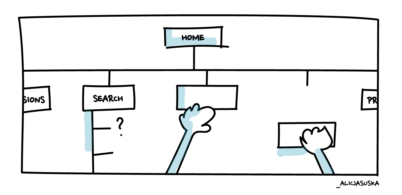
We started by mapping the current information architecture of Sourcegraph. It gave us the perspective that we needed - a 10,000-feet view of the experience. From here, we could start identifying improvements.

Not all changes should be made within one iteration. It is important to identify the most impactful ones and target elements that are the most visible for the users first. Navigation patterns were a great candidate - they have an impact on all our users and influence the structure of many pages.
We have introduced new headers that maintain consistent structure on all the pages. In addition, we have added breadcrumbs for better context and easier navigation.

Build and start using the component system
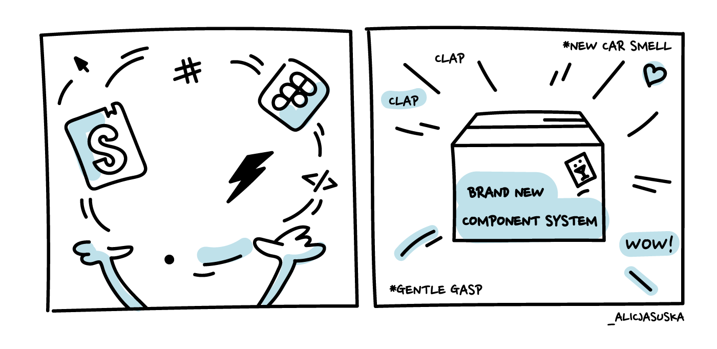
Over the course of the last couple of months, we have also realized that, in order to produce the desired outcome at a satisfying pace and scale, we need to improve our design system. We have decided to apply the DRY (Don’t Repeat Yourself) code development principle to all our efforts. We have managed to achieve the following:
Align our design files with Storybook
Using design components that represent the actual implementation is life-changing for both designers and developers. It reduces inconsistencies, makes communication easier, and the handoff process faster.
In the beginning, our Figma library was not consistent with the implementation. Some components were outdated, some were incomplete, some were created as examples for the future. In effect, every design project had to start with manually comparing design files to what is actually built on our platform. It was very ineffective.
In order to change it, we started by listing all the components that needed to be corrected or created. We decided to hire a contractor who helped us manually build out all the missing items in Figma. In general, Storybook was the base for our work. We went back and forth between those two tools to effectively align all the styles and variants.
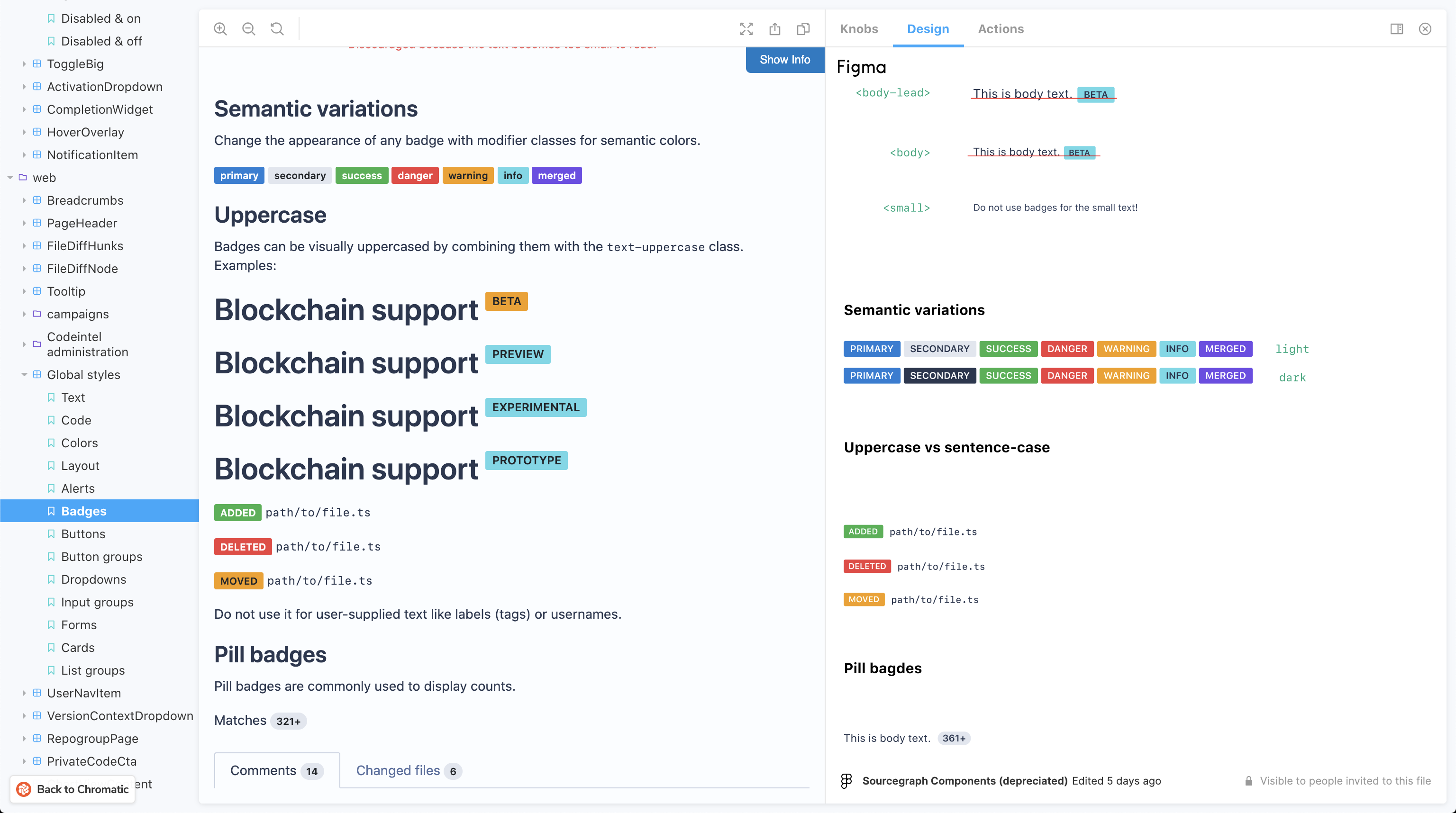
We have also introduced some improvements to our flow to help us keep the consistency we have achieved so far. We have added the Figma add-on to our Storybook. This way, both design, and implementation are visible next to each other and are easy to compare.

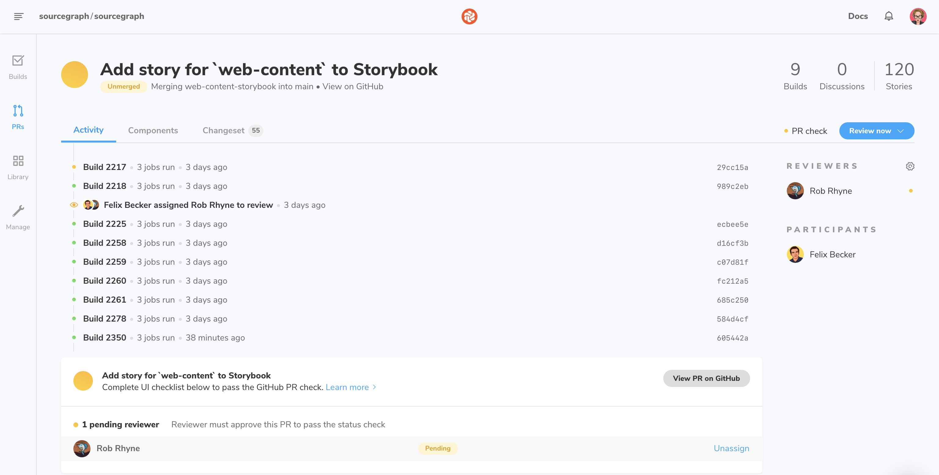
In addition, we started using Chromatic. This tool helps us gather feedback about changes to Storybook and makes the review process easier. From now on, a Chromatic PR review is an integral process of approving all Storybook-oriented PRs.

Make design components more flexible
To work more efficiently, we needed to create reusable components that provide a high level of flexibility. Our effort already started paying off. It takes us less time to build the interfaces and designers have more energy to spend on key activities.
Headers described earlier, are a great example of an editable component we have created in Figma. Designers can edit elements like page titles, breadcrumbs, or buttons. Every instance is linked to the parent component and is automatically updated if its styles change. In addition, each design component is created in two variants - for light and dark themes. Thanks to using the consistent naming convention of .../light and .../dark, it is easy to switch between the modes. It is also worth mentioning that color names in Figma are aligned with CSS variables used by our developers. It makes the design handoff process easier and prevents us from using colors from outside of our pallet.
See this design in Figma
Define a process of requesting changes to components
To keep our design system up-to-date we have set up a review and approval process for improving and adding the components. First, the designer prepares a proposal with visual examples of Storybook, in-product usage, and suggested change. We perform a Sourcegraph search to identify all the affected areas. After getting approval from other designers and developers, a GitHub issue is being created and changes to our design system can be implemented.
A most recent example of the change that was proposed using this process is an update of our outline buttons and button groups. See the proposal and the pull request for more details.

What’s next?
We are planning to stay on this path of improving consistency and learnability. In the nearest future, our efforts will be focused on two big areas of our product - Sourcegraph extensions and the browser extension. We are very excited about the upcoming months and we would love you to share your feedback about all the changes that we are making. If you have any suggestions, please reach out to us at @sourcegraph or by filing an issue.