Strange Loop 2019 - RGB to XYZ: The Science and History of Color
Overview
Color is a fascinating subject. It is both incredibly subjective (ie. what makes a painting beautiful) and perfectly scientific (ie. wavelengths of light) at the same time. This talk will be a deep dive into the history and science of color and the fascinating world of human perception and the scientists that attempt to define it.
Introduction
John Austin is an independent game developer. He is here today to talk about color!
The talk begins with an overview of when color was beginning to be standardized. At this time in history, math was being done on slide rules and there was barely a concept of electrical computing. Electricity was still not available throughout all of the US and the country was going through the biggest depression in US history because of the stock market crash. In the midst of all of this, a group of people decided this would be a good time to get together and come up with a unified standard of color.
In 1931, a group of representatives from various countries met in Paris, France to come up with a unified standard of color. This group of people came up with the systems that still last 100 years later and underly all of the systems we use today for colors.
Color Science
The talk then went into how we perceive color and how relevant it is in our everyday lives. In today’s world, color is everywhere - on the web, in books, in our clothing. In this world of color, we assume that we must have complex systems to manage it but most use of color is just eyeballing until things look about right.
Color is a weird subject because it is both objective and subjective. It involves science and art at the same time. Looking at biology, you can think of light as a pipeline. It bounces around the world, bounces into your eye, hits a few sensors and then goes into your brain.
Light is a spectrum. We can only see a fairly small part of the spectrum. If we were built differently, we would see different parts of the color spectrum. When light hits our eye it goes into cones. Cones are responsible for our color perception. When perceiving color, humans have short, medium and long cones that all respond differently to the spectrum but mostly align with red, green and blue.
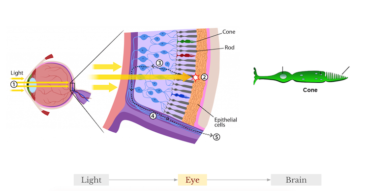
Each cone produces a number. If you are looking at an apple, each of your cones responds in a different way and three numbers are sent to the brain. You only need three numbers to describe every single visible color that you can see! Animals also perceive colors differently. A pigeon has five cones so they might see totally different colors, this is just a biological happenstance. Color is pretty weird, right?
Color History
We go back to the 1930s and the systems that were created to learn more. Back then, the main concern for standardizing colors was globalization. For example, plane and boat signal light colors were very important. If you tell your ally that green is on the left and red is on the right, it is extremely important that there is standardization there for proper communication.
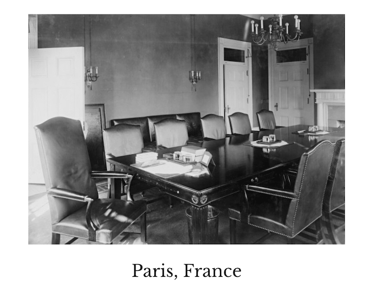
The 1931 Paris event was called the CIE 1931 International Commission on Lighting. It was a big convention attended by many countries and the plan was the vote on the specification that defined a standard on color. Before the event, a report suggesting how to standardize was sent out ahead of time. At this event, Britain and the US were some of the most important players and did most of the color science for the past decade.
Two of the important attendees were John Guild and Irwin Priest.
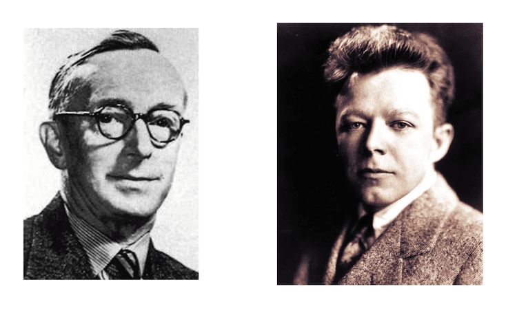
John Guild worked at the National Physical Laboratory in England. He created the system that was to be voted on at the convention. The main theory of his system was additive primary colors.
Irwin Priest was President of the Optical Society of America. He was upset about how the convention was being run. First, the reports everyone was supposed to review were only sent out a month in advance, so attendees didn’t have much time to study them. Also, the US already had a color system and had adopted it. It was not based on the additive primaries concept from John Guild but was driven by industries instead. The US color system was based on hue, saturation, and brightness.
Irwin arrived at the Paris event a week early to meet with John Guild to discuss the proposed color system. Together they settled on a final set of systems. They presented a new set of resolutions called the CIE 1931 Resolution of Color, which we use now to define our color spaces. The final resolution was based on John Guild’s additive primaries theory but with modifications.
Color Spaces
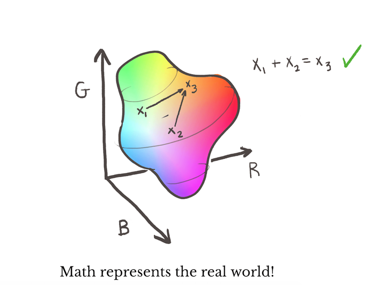
Let’s discuss additive primaries. Back in the day, you couldn’t measure color without super-specialized tools. If you take a target color on one side and then place three primary colors on the other side with known wavelengths, you can add and subtract from those three colors until you have the target color. It gives you three colors or how much of the primaries you need to make up that color.
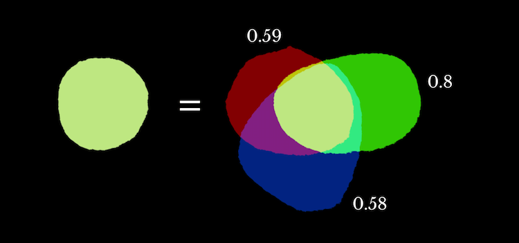
If you plot these colors in 3D space, with each axis being the amount of the color - then you get a volume of color, which is the color space. It is literally a space with a bunch of colors in it, also known as color volume.
You can do math in this color space! You can take three numbers and add them together and the color you would get from those numbers would be the same as the color you would get in real life using lights. This was the fundamental basis of how we use color and that’s how they put together these early color spaces.
When making the first color space, there were issues and it is easier to describe by going into 2D space. You actually cannot present all colors with a fixed set of primaries. This means that today you cannot make a monitor that can present all visible colors if you use a fixed set of primaries.
They realized that to map out color spaces, they had to be creative.
Take a cyan color for example. You cannot make this color with two other primaries. Instead, you can add a color on the cyan and treat it as a negative number. This will make the two primaries and the cyan color equal.
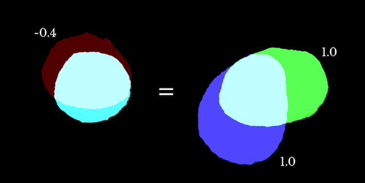
By using this negative, they were able to map out the full color space. This creates CIE-RGB. CIE-RGB was the first color space, the granddaddy of all historical color spaces. It is different from our modern RGB and it just happens to use RGB as the primary colors. In this case, you can use a scientific process to find the correct color.
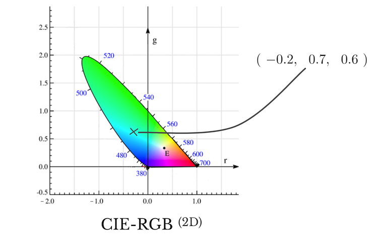
But CIE-RGB has a lot of problems. Colors can have negative numbers which make things super weird. And they were also doing math on slide rules, so negatives were awful to work with. They needed to make a more ergonomic color space and transform this color space into something better.
When working with color transformations, they have to be linear. This means that the origin must stay in the same spot and the lines have to stay straight. You need it to be linear to get mathematical behavior.
CIE-XYZ is a color space where we can stretch our color space to be positive instead of negative. It is called XYZ because the axis does not have meaning anymore. The Y-axis is aligned with brightness. It is mathematically beautiful.
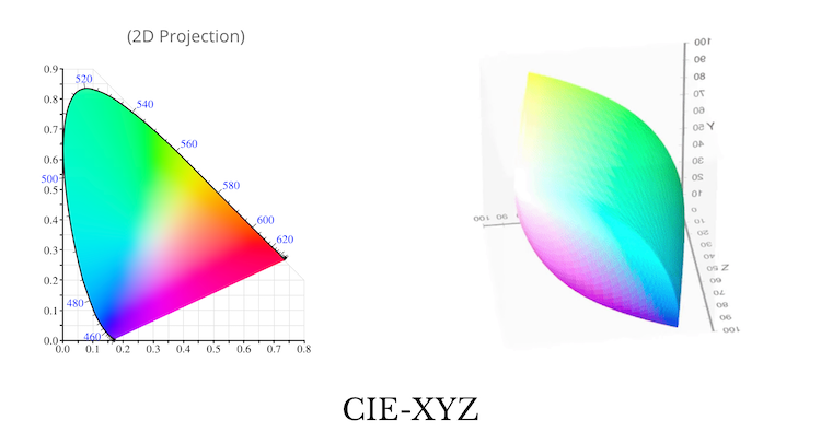
CIE-XYZ is the main player in today's world when it comes to color. If Adobe was to create a new color space, they would provide a transformation back to CIE-XYZ, rather than the other color spaces.
Now in 2019, we are in the digital world. Color is everywhere - in our monitors, displays, and images. Back in the 1970s, they realized that we needed a color space for the digital world. This is where sRGB comes in. This is the color space you have been waiting for, this is what is being used when you use a color picker in Chrome or in Photoshop. This is the "standard RGB"!
sRGB vs XYZ
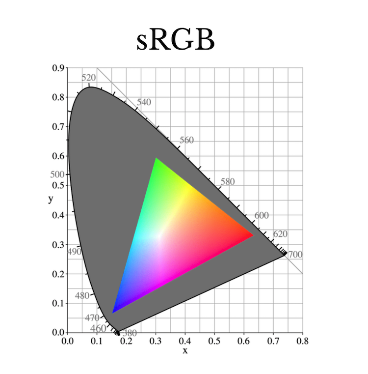
sRGB is a subset of XYZ. Monitors use visible primaries so it has to be a subset, and it is a particularly small subset. It was originally designed for CRT monitors, and they were not able to display more than the small subset.
Interesting to note, we are looking at this presentation right now in sRGB!
sRGB is just one more transformation. There is a weird quirk. When you look at a gradient, we are much better telling the difference between darker colors versus lighter colors. This was realized in the 1970s. So they decided to add more bits down at the part where we can tell the difference.
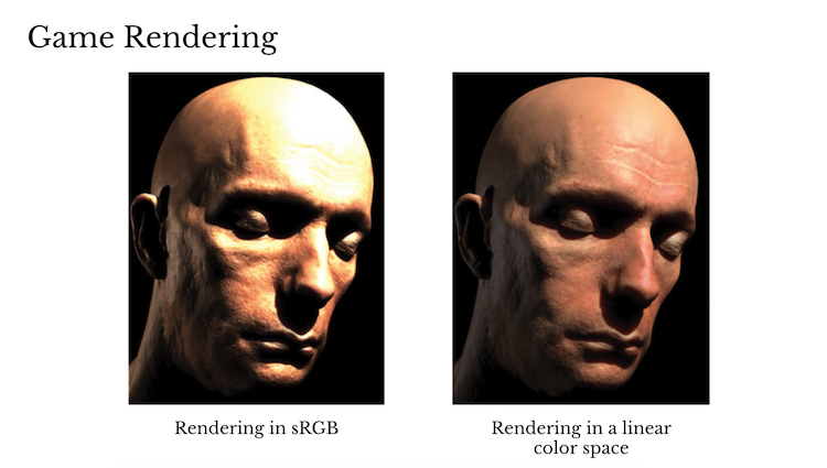
Then they applied the gamma curve (essentially a square root). The curve spreads out the color space so that it is more optimal for storage. But this is not linear! What ends up happening, is that math is not correct in sRGB. If you add two colors, you won’t end up with the color you would get if you add them in real life. This is a perceptual problem in an incredible amount of software. So you probably shouldn’t be doing math in sRGB.
You might think this isn’t a big deal. But in 2010, most game renderings were done in sRGB. All of the light was thrown into an exponential function and it looks awful. So after 2010, gaming started using a linear color space instead for a more realistic look. Generally, most game engines now use a linear sRGB.
But this is not quite the end of the picture. Maybe we don’t want scientific accuracy. This has been all about recreating the properties from real life so far, but what if you want to be more artistic with your colors?
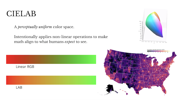
Looking at linear RGB, the colors don’t seem to have equal brightness. Our color perception is not smooth. CIELAB is a color space where the color is perceptually uniform. It intentionally applies non-linear operations to make math align with what humans expect to see.
CIELAB is the secret gem for the data visualization community because all of these visualizations are driven by data and math. If you do a gradient in RGB you can get a dark spot or weird hues. CIELAB was built for uniformness.
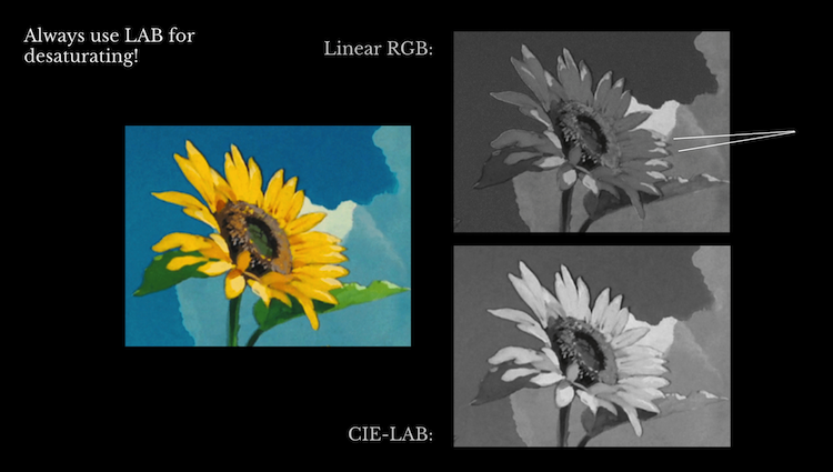
Let’s look at one more example using CIELAB. Say we want to desaturate an image. In this example, we have a picture of a sunflower and grayscale it using CIELAB vs linear RGB. The results look similar but if you look closely, the sunflower is super dark in linear RGB compared to CIELAB. If you are doing math on color, think carefully about what color space you want to use.
A chart of which color space to use is below:
What color space should I use?
Linear sRGB
- Why? When you want to recreate the behavior of real-world light.
- Uses: CG Rendering, Science
- Math: Math recreates the behavior of the real world
sRGB
- Why? It is the universal transfer format.
- Uses: File I/O, Display Devices, RGB generally implies sRGB
- Math: Please, no math
CIELAB
- Why? When you want to recreate the behavior of human perception.
- Uses: Data Visualization, Color Interpolation, Perceptual measurement
- Math: Math is incorrect to reality, but looks perceptually smooth.
In summary, if you really want to create correct to life light, use linear color. But if you care about perceptual correctness, smoothness, and uniformity use CIELAB. In general, we have to use sRGB because it is expected. But we should probably get out of sRGB as soon as possible.
Contact Information
Follow John on Twitter @kleptine. He posts about games, art, and math!
His website: https://johnaustin.io
Watch the Official Recording on Youtube
