Strange Loop 2019 - Beyond Alt-Text: Trends in Online Accessibility
Overview
If you're like the 2016 version of me, then you think you have a decent handle on web accessibility. You put alt attributes on all your images (though you don't give much thought to the actual text) and you make sure your sites can be used with a keyboard (except for overlays sometimes). Then the day comes when you're given a 100 page accessibility audit from a client and a deadline for all issues to be fixed. What is high contrast mode, you ask yourself, and why does it matter if these links are implemented in a list?
A bit about our speaker - Ian Forrest
Ian is an Engineering Manager based out of Toronto. Currently he works at BiblioCommons, where he leads the development of a multi-site WordPress application used by public libraries in over twenty cities including St. Louis, Chicago, and Boston. He has also had some successful side projects including gradient-animator.com, a CSS generator for animated gradients. In his free time he enjoys watching old movies and hopelessly cheering for local sports teams.
A Little Terminology
Terminology is important, it helps each of us to understand exactly what we are talking about.
Disability: a physical, mental, cognitive, or developmental condition that limits a person's ability to engage in certain tasks or participate in typical daily activities.
What's important here is to pay attention to the word typical, this is key. Disability can be very contextual.
For example, a person with a seizure disorder might not identfy as having a diability depending upon its severity and if they use public transportation. The same person, in a rural area, might identify as having a disability if they can't have a driver's license.
Disabilities can also change over time. We can develop disabilities as we age, due to an accident, or if we develop a health condition. This can also work in reverse. For example, those with some health conditions or mental illnesses can improve with medication and/or therapy. These individuals might not identify as disabled due to their improvement.
Assistive Technology: tools that help people perform tasks that might otherwise prove challenging or impossible.
Examples include:
-
A wheelchair
-
A white cane
-
Hearing aids
-
Screen magnification software
-
Screen readers, which are software that helps people with vision disabilities use computers. (JAWS, VoiceOver, NVDA)
-
Speech input software, like Dragon Naturally Speaking or even Siri
-
Other tools for people with motor disabilities (see link below for more details)
a11y
Accessibility. The 11 stands for the 11 characters inbetween "a" and "y" (a***********y)
Legislation
In the US, the Americans with Disabilities Act (ADA) of 1990, amended in 2009, is the legislation that governs accessiility.
Guidelines
Web Content Accessibility Guidelines (WCAG) defines how to make the web more accessible to people with disabilities. WCAG 2.1 is the current standard and has more for mobile, low vision, and cognitive disabilities. Their guidelines are broken into tiers, where most aim for level AA.
Technical Specifications
Accessible Rich Internet Applications (ARIA) is a tool at your disposal to meet WCAG standards (aria-hidden and aria-labeledby as examples), however, this should not be your first tool of choice. Using HTML elements to their semantic specifications is what you should be doing first. As an example, don't use <div className="button"...> as divs are not focusable by default. A much better method would be to use a button and then apply a style.
So why do we care about accessibility, a history lesson
Our physical spaces come with a lot of affordances which exist to help people with disabilities. For example, wheelchair ramps, stair railings, buttons to open doors, etc.
However, we all use and take these for granted. These public affordances didn't always exist. In fact, most of this didn't exist even in the 1960's.
A strong disability rights movement took place in the 60's and 70's, thanks to Ed Roberts, that really changed the way we perceive and value people with disabilities.
Although this major shift in public opinion occurred several decades ago, we can still see renovations and retrofits occurring to public spaces. The Toronto subway stations are a prime example. The stations were built in the 60's and are today retrofitting elevators, a very slow and expensive process.
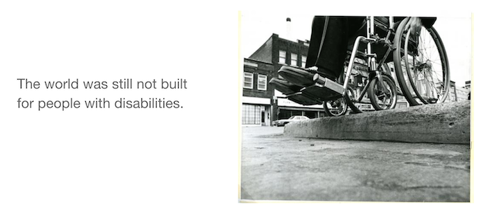 This is a standard curb with an approx 5 inch drop for this wheelchair.
To fix the above wheelchair problem, curb cuts were invented. For the first time, wheelchair riders are able to get around town on their own.
Curb-Cut Effect
The idea that improvements we make for users with disabilities end up making things better for everyone.
Many people don't actually realize curb cuts were initially designed for wheelchair riders. People assume that they exist to help with strollers, luggage, pull carts, etc.
While the curb-cut effect benefits everyone, its important to remember that these affordances are essential for people with disabilities.
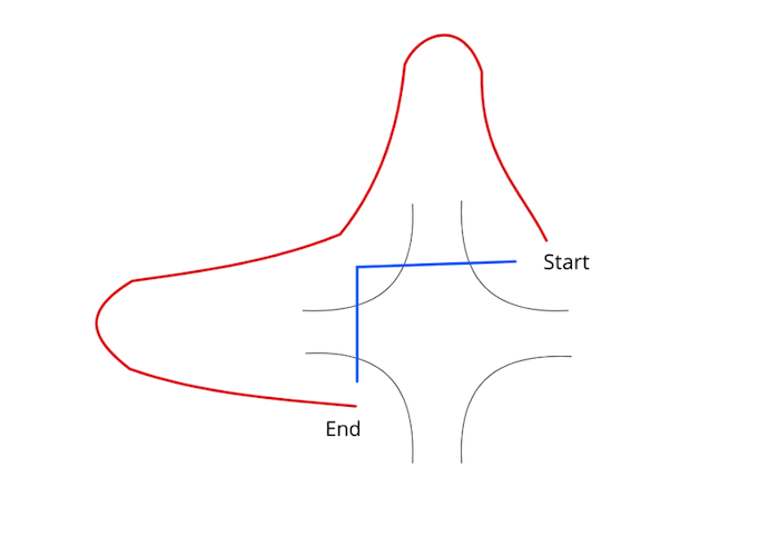 Here we have the path a wheelchair must take to get from one corner at an intersection to another without curb-cuts. Crossing the street is no longer a simple matter for a wheelchair rider.
Today, we're in the midst of a similar push for disability right, but this time for our digital spaces.
Accessibility's greatest hits, also known as "where the heck do we begin"
Now that you understand a little bit of accessibility history, let's look at some ways to improve the accessibility of your website.
Ian didn't want to mention WCAG very much, while its incredibly helpful he feels its best to start looking at concepts before looking into the exact requirememnts you need to meet to accomplish that goal.
So where do you start with accessibility? Your keyboard.
Focus Management
- Goal: Users are able to tab through a page in logical order
- Make sure the user can tell which element has current focus
- Show the "blue outline" that is default on links, its essential to this goal. (Outline none, or zero, is so bad it has its own website.)
- Ensure that focus is adjusted when events such as a modal/overlay pops up.
- Use skip links when necessary to aid in page navigation.
- Think of focus outlines as a "digital curb cut" and how they can be helpful to all users. (Removing link outlines, as well as link underlines, are a type of reverse curb-cut effect.)
Alt Text and Screen Reader Text
- Goal: screen reader users can understand what the active element is.
- Context needs to be properly communicated to the user through alt text for images, icons, etc.
- Don't forget links, pagination, etc that are important in page navigation.
Repetitive Links
- Avoid duplicate or repetitive links for a screen reader. This is not efficient navigation.
- Use skip links as well as hiding links from screen readers to ensure efficient page navigation.
Headings
- Screen readers rely on HTML headings (H tags) to understand how the content on the page is organized. Think of this as a table of contents.
- Headings of the same level do not need to be styled the same.
- The semantics that headings provide to screen readers is the most important thing here.
Low Vision
- Magnification: Use a relative font unit like rems or ems to accommodate screen magnification.
- Color Contrast: Colors should meet WCAG AA requirements to color contrast which benefits all users as another digital curb-cut.
- High Contrast Themes: these themes allow users with low vision to use your site with less difficulty. However, this comes with its own hiccups for CSS implemented background images.
Cognitive Accessibility
- Remember that your users are varied in terms of reading level or cognitive abilities.
- Example isues could be:
- icons that the user doesn't understand
- when the tab order on a page doesn't make sense
- if your target audience and content reading level do not match
- HemingwayApp is a tool that you can use to test the readability of your sentences or paragraphs.
Accessibility culture where you work, what YOU can do
EVERYONE NEEDS TRAINING
Everyone needs to know the basics and be aware of accessibility concerns and needs to create a better solution for a websites intended users.
Two recommended training:
- Web Accessibility By Google: Developing with Empathy
- Frontend Masters: Accessibility in JavaScript Applications by Marcy Sutton
Always test for accessability. Reach out to local accessibility communities for feedback as well as assistance in testing.
SHARE YOUR KNOWLEDGE
Document your accessibility improvements as much as possible to ensure accessibility is consistent throughout all aspects of a project and are clearly understood by all team members.
A great example of this is eBay's accessibility documentation.
INTERNAL COMMUNICATION
Create a slack channel for internal communication regarding accessibility. This is a space where you could ask for feedback, share resources, or generally have accessibility discussions.
Closing Thoughts
- Accessible patterns benefit everybody, but are essential for the people that need them the most.
- Accessibility is about more than screen readers.
- Show some damn empathy, this has an effect on real people.
Watch the Official Recording